Cognitive Walkthrough and Heuristic Evaluation
Cognitive Walkthrough and Heuristic Evaluation
About the project
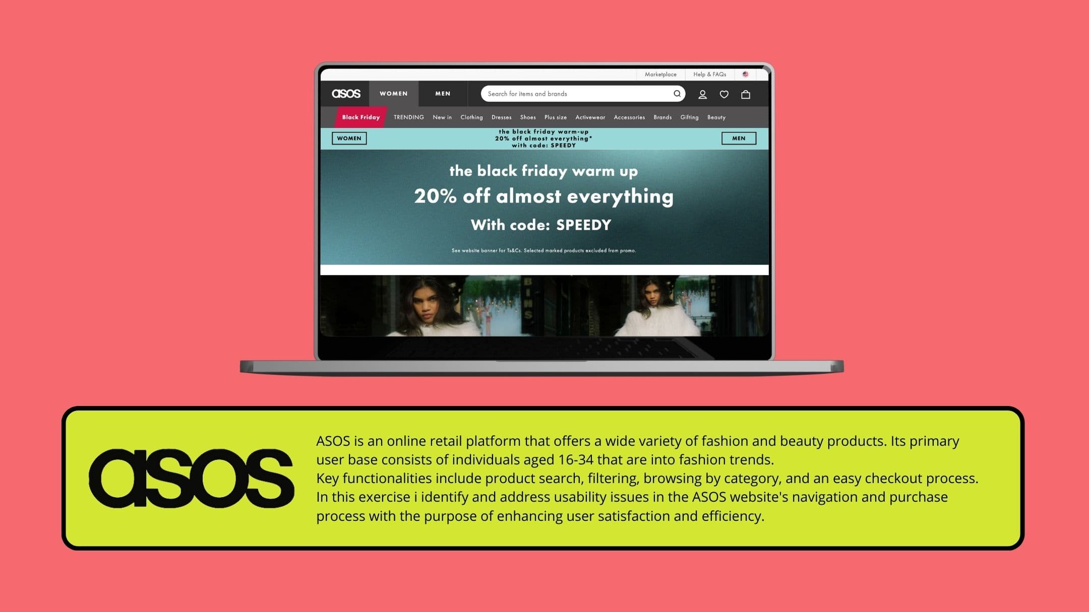
This project was part of a qualitative research exercise to assess the usability of the ASOS e-commerce platform. The focus was to analyze user interaction during key shopping tasks and recommend interface improvements using the Cognitive Walkthrough method.
Challenge
ASOS is a widely used online fashion retailer. However, its broad product offering and constant UI changes present challenges in navigation, promotion visibility, and checkout clarity. The goal was to identify specific friction points that affect user experience and conversion.
Research and Insights
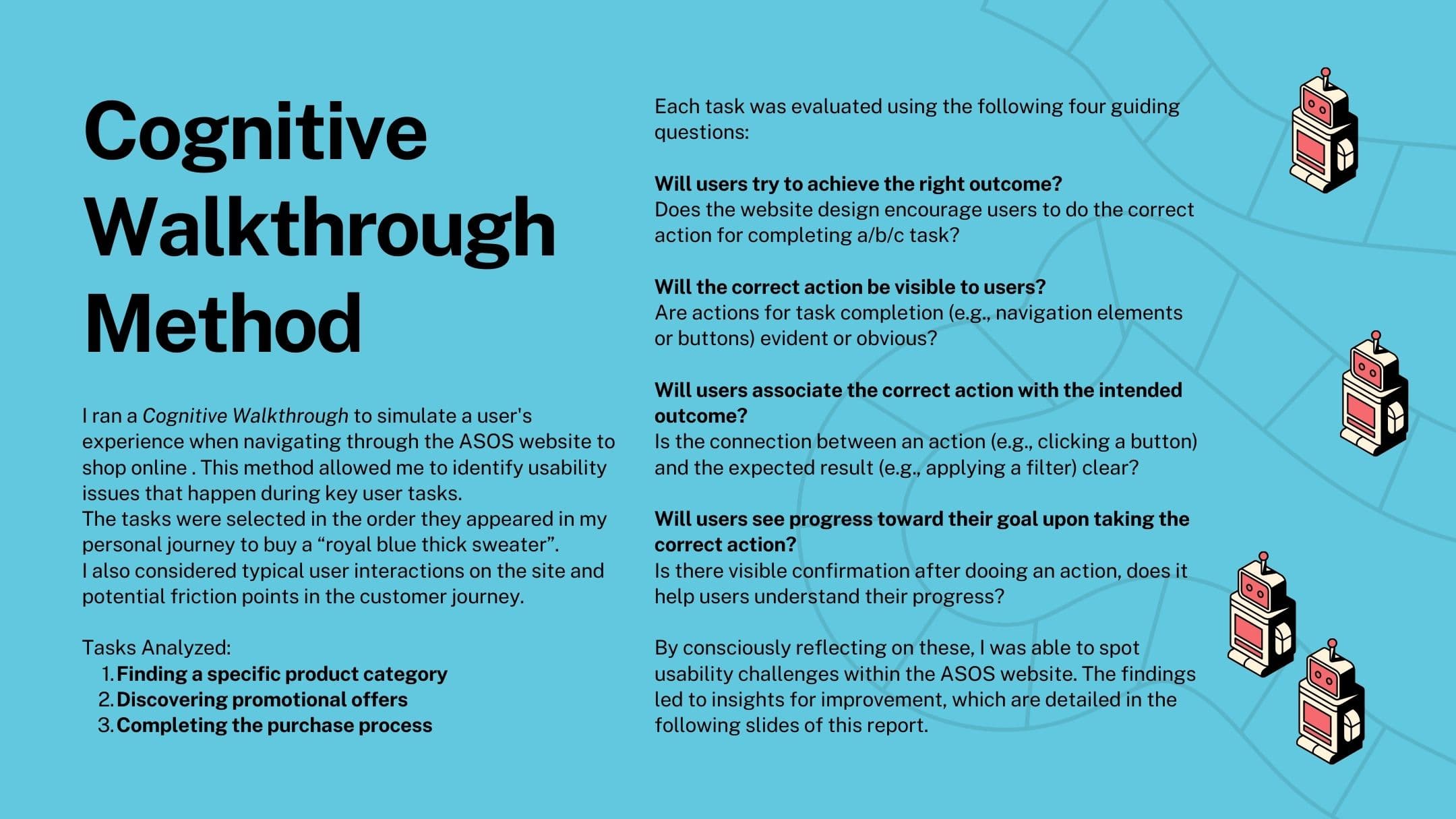
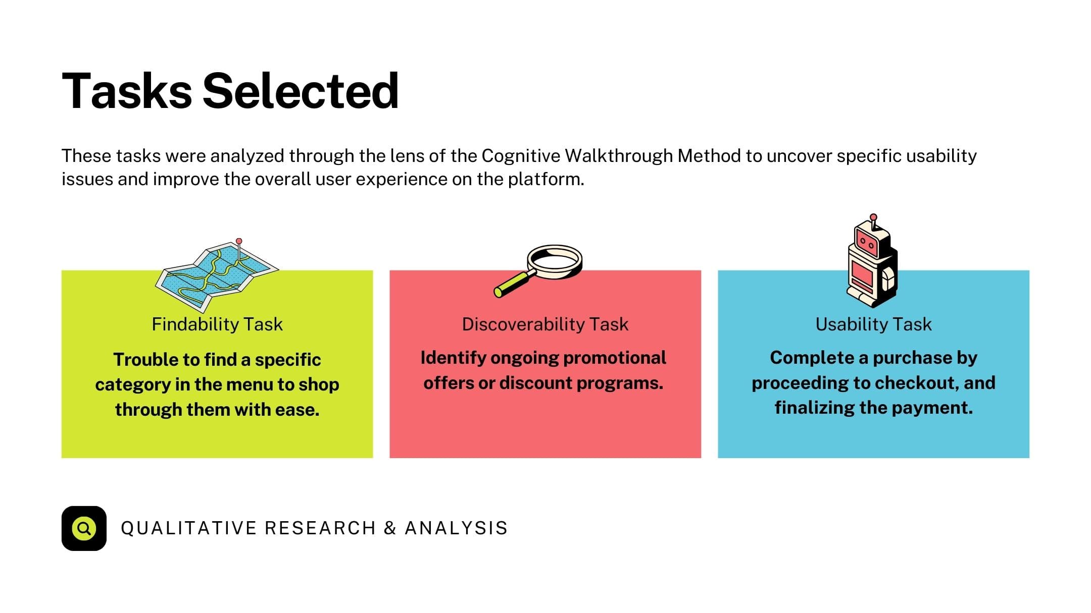
Using the Cognitive Walkthrough method, I simulated the experience of a user shopping for a “royal blue thick sweater” to evaluate the platform across three key tasks: finding a product category, identifying promotions, and completing a purchase.
Key insights included:
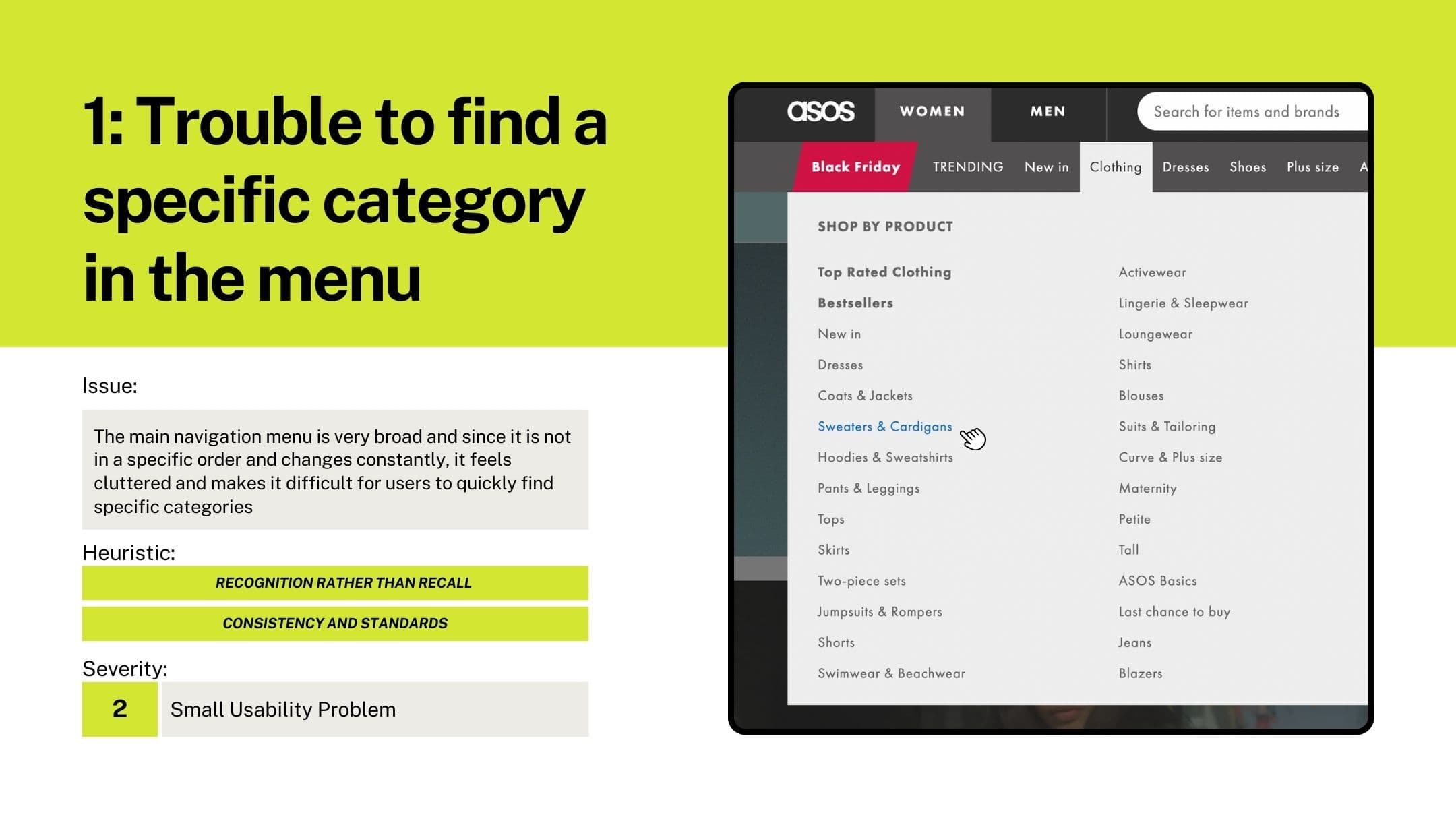
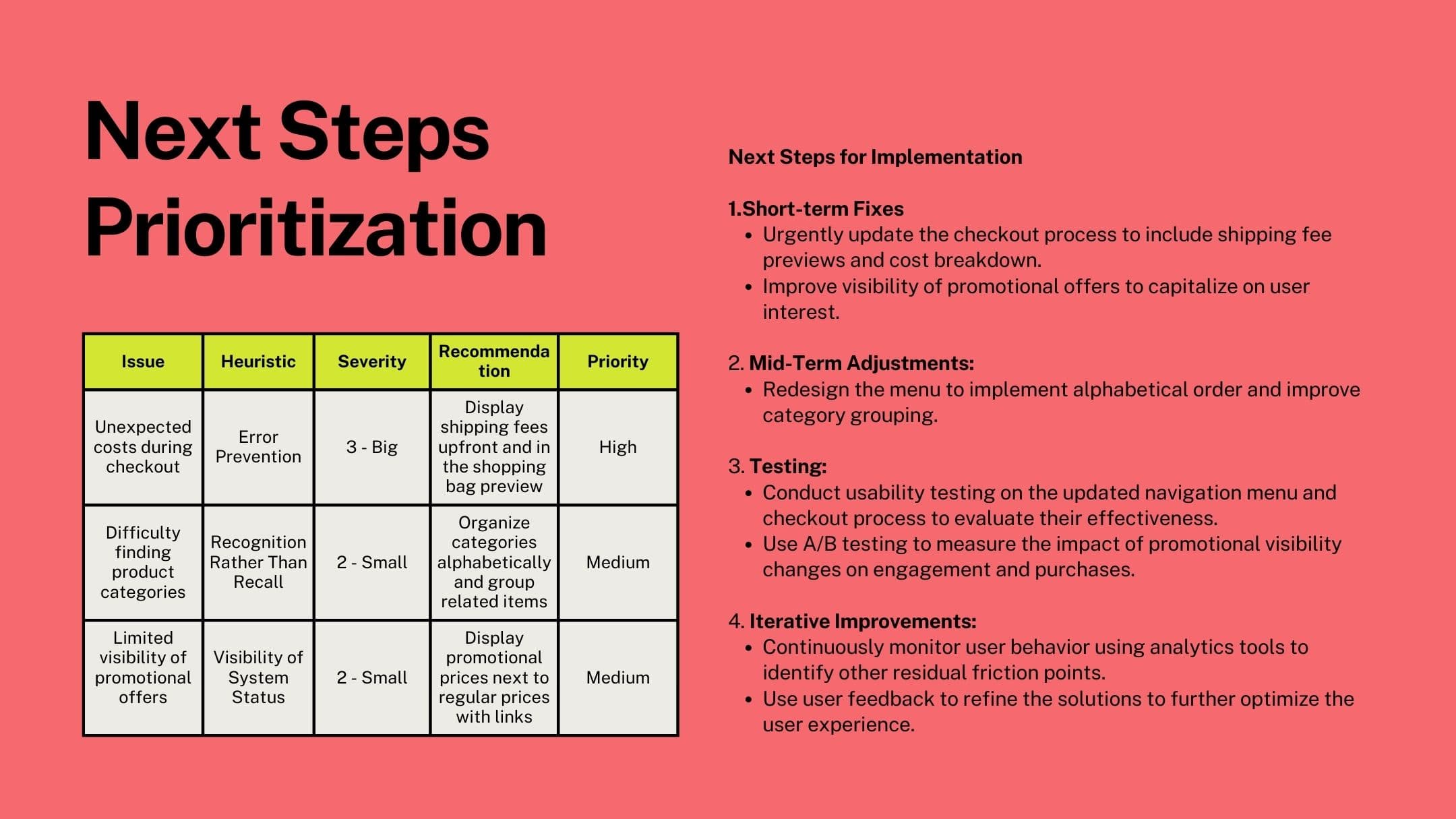
Navigation menu feels cluttered and inconsistent.
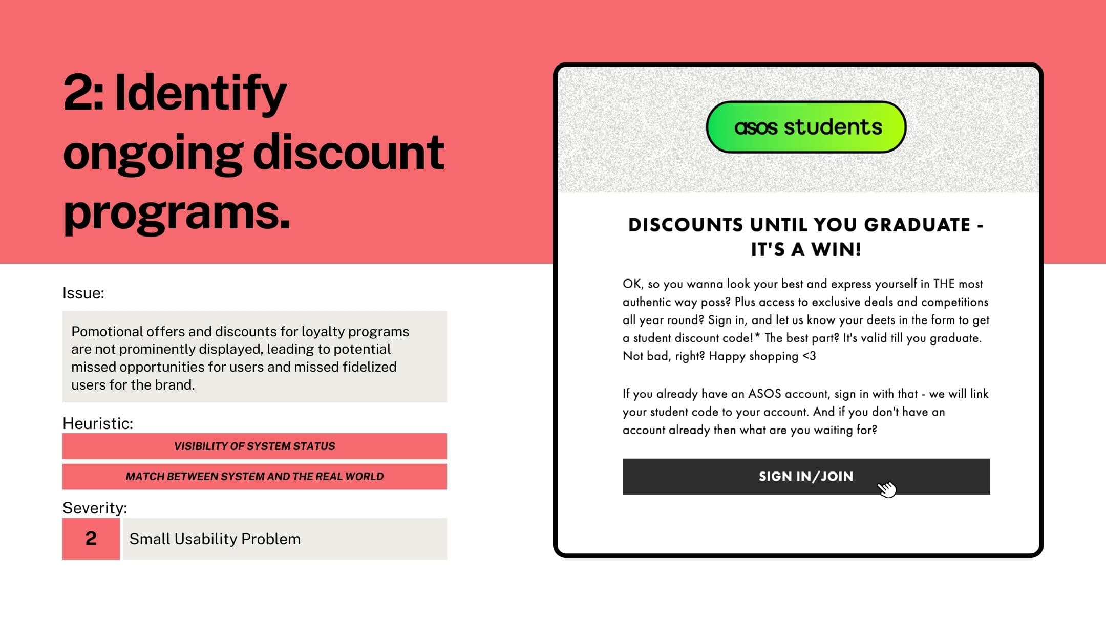
Discount programs are hard to find, limiting their impact.
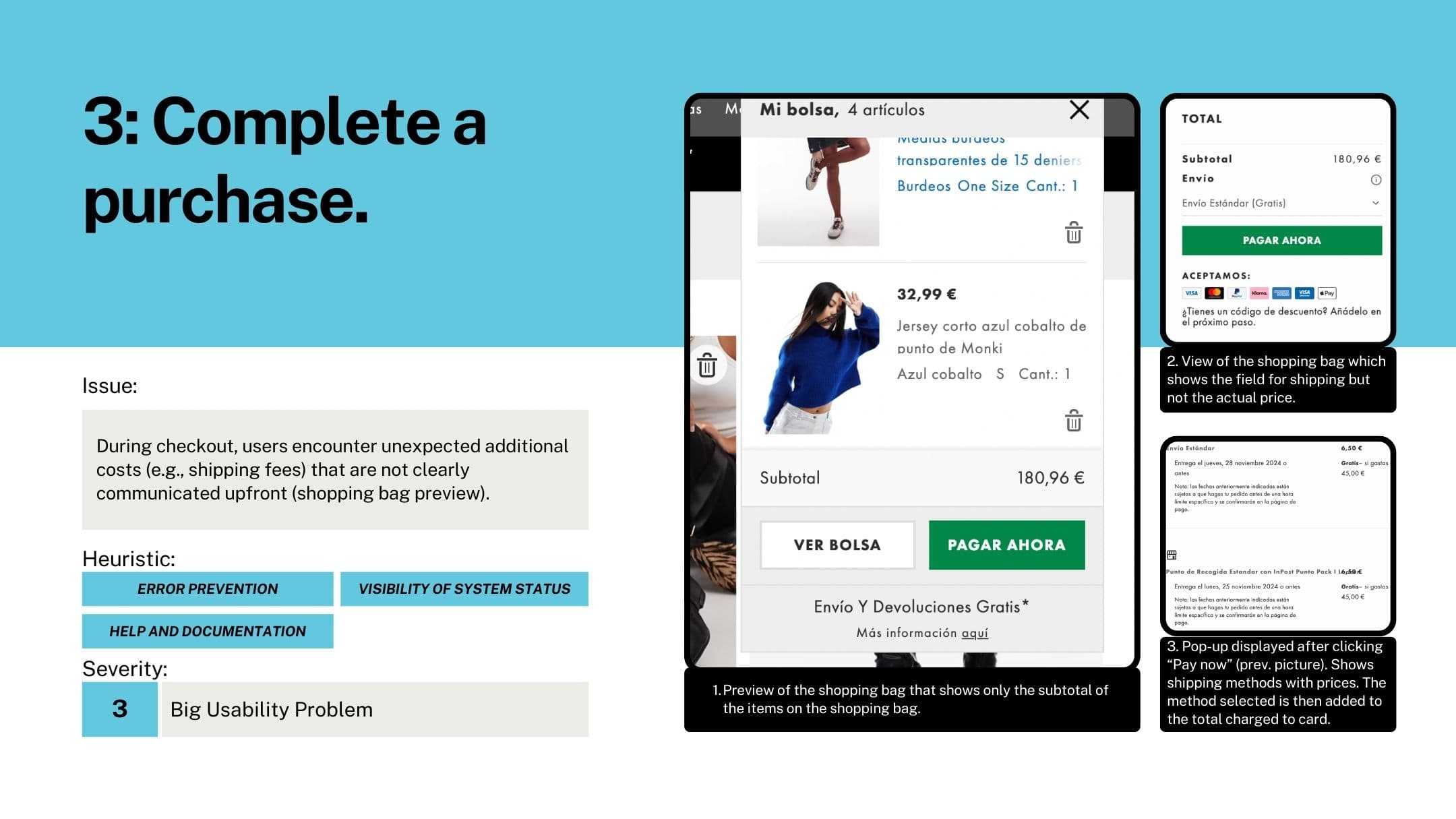
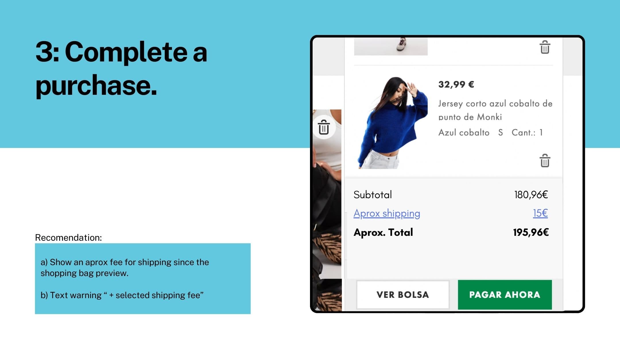
Unexpected shipping fees appear late in the checkout process, creating friction and mistrust.
Solution
Three major design recommendations emerged:
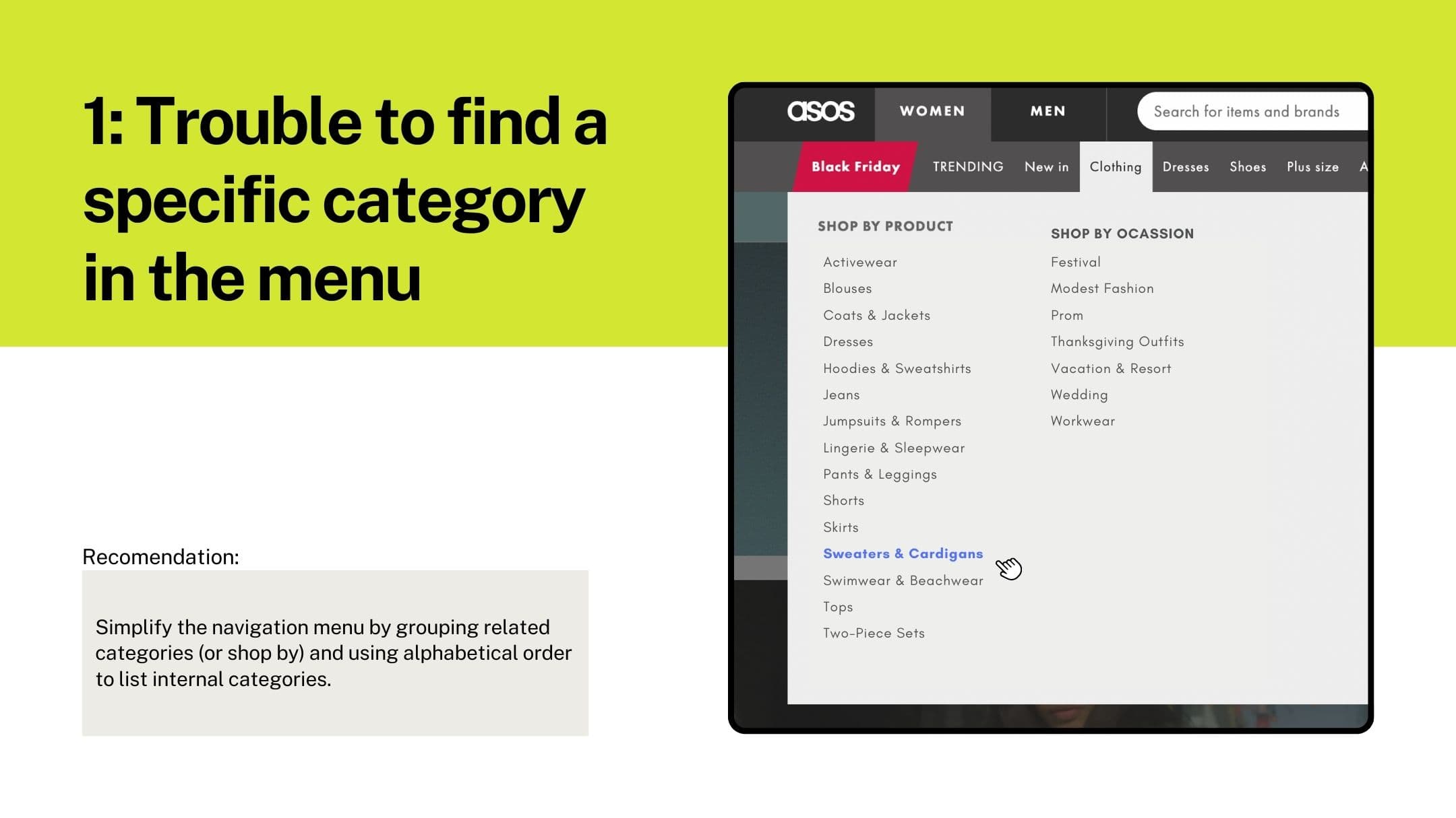
Reorganize the navigation menu using grouped and alphabetized categories.
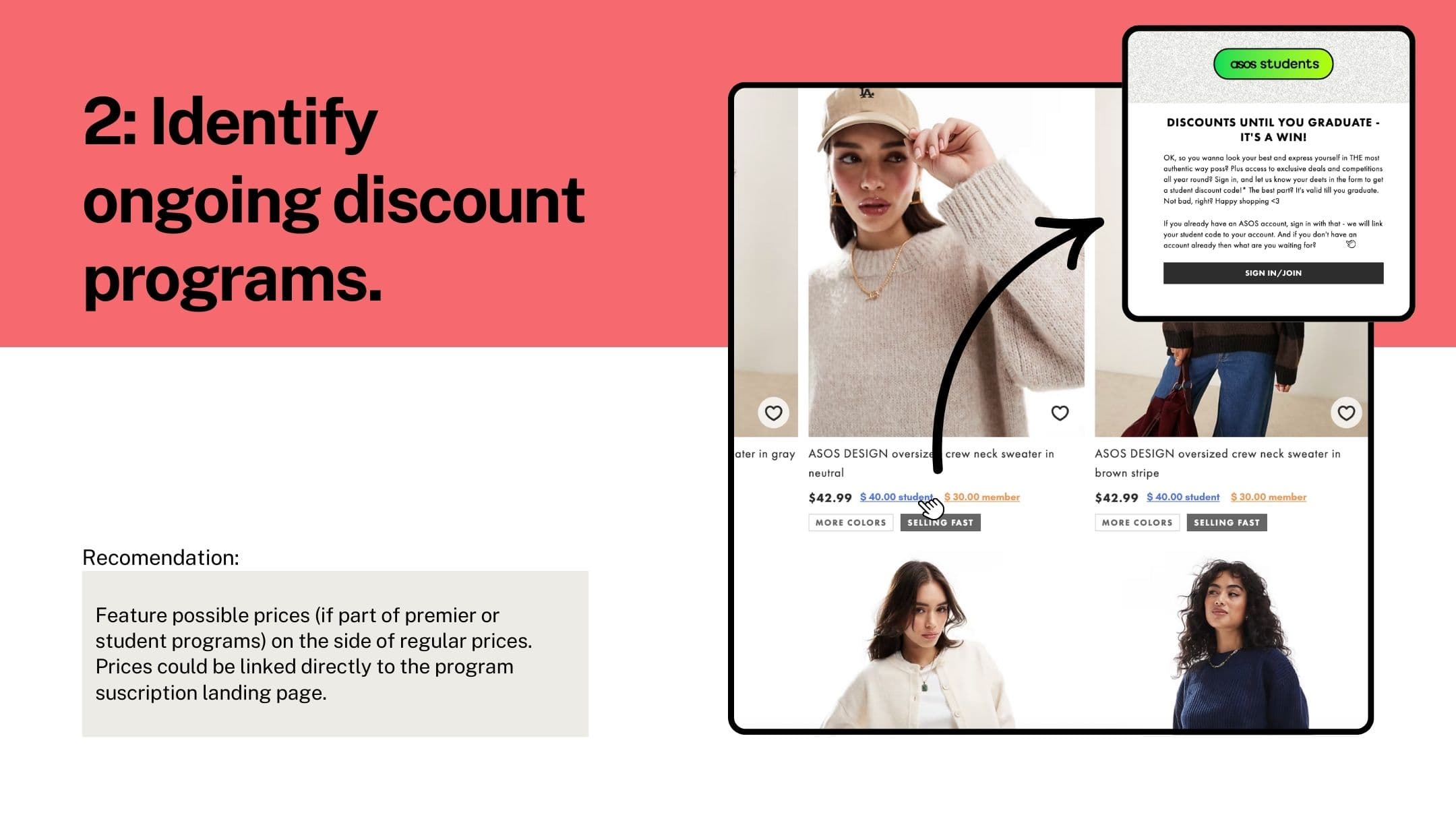
Improve promotion visibility by displaying program-based discounts next to prices.
Increase transparency during checkout with earlier, clearer shipping fee previews.
Impact
The insights were synthesized into a prioritized improvement roadmap for the ASOS UX team, offering short-term fixes and mid-term testing suggestions (A/B testing, usability testing). The project demonstrated how methodical UX analysis can identify design opportunities aligned with user expectations and business goals.